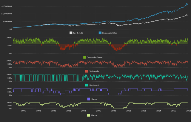
For long-time subscribers, the current composite model reading is 0.81.
In a previous article, I outlined both the purpose and construction of my Simple Stock Model. Keep reading for a quick run-down if you’re new to the model; otherwise, you can skip down to “Technicals” for the updated data.
Investors are constantly exposed to sound bites and data points presented without any proper context. You might have read an article about how stocks have historically bounced when sentiment has reached a negative extreme. Or, that you should be out of the market if it’s trading below its 200-day moving average.
When I come across articles like that, I always think it was short-sighted to base an opinion on the S&P on only one indicator without also considering a wide variety of other inputs.
The goal of the model is to help you form a data-based outlook on the S&P. Additionally, at the end of this article, I showcase a composite model that incorporates all of the indicators I use, so your view can be comprehensive as opposed to having tunnel vision on only one indicator.
How the Model Works
Each article is broken down into four main sections: Technicals, Sentiment, Rates, and Macro. Each section includes a number of different indicators. For each indicator, there’s a “filter rule” for when to be out of the market. In the spirit of simplicity, the filter rule is always binary, dictating either 100% long exposure to the S&P or a 100% cash position. The S&P is represented by the SPDR S&P 500 Trust ETF (NYSEARCA:SPY). Let’s dive into an example graph. All graphs are from the Simple Stock Model website:
The above data is from Yahoo Finance. The graph shows the price momentum indicator within the Technicals section. The bottom portion plots the momentum metric over time, and the top portion plots the historical performance of following the filter rule.
For each indicator, new data each weekend is used to generate a long SPY or cash position for the next week. For the above momentum example, SPY’s dividend-adjusted close as of Friday is the main input. Using this, I calculate the 12-month total return. For each indicator on this site (except for the macro data), I take a four-week average of the main indicator input.
So, for this example, I’m taking the four-week average of 12-month total return momentum. Why four weeks? To reduce false positives and whipsaws when an indicator is bouncing slightly above or below its filter rule. There’s nothing special about a four-week average. You could use two or eight weeks and reach similar results.
Data is compiled as of Friday’s close. Buying or selling decisions occur at Monday’s close. I do this, as opposed to making trades at Monday’s open, simply because I had a more reliable data source for dividend-adjusted close data. It’s also important to reflect realistic transaction costs. Each simulated historical performance graph factors in a $10 trade commission and a 0.02% spread on SPY for each buy or sell. Commissions and spreads are lower now, but considering SPY started in 1993, I chose to use these above-average numbers.
Now you understand the methodology behind the model. Each week, I’ll cover a handful of indicators, especially those that have changed positioning over the past week. Let’s start with technicals.
Technical Data for the S&P 500
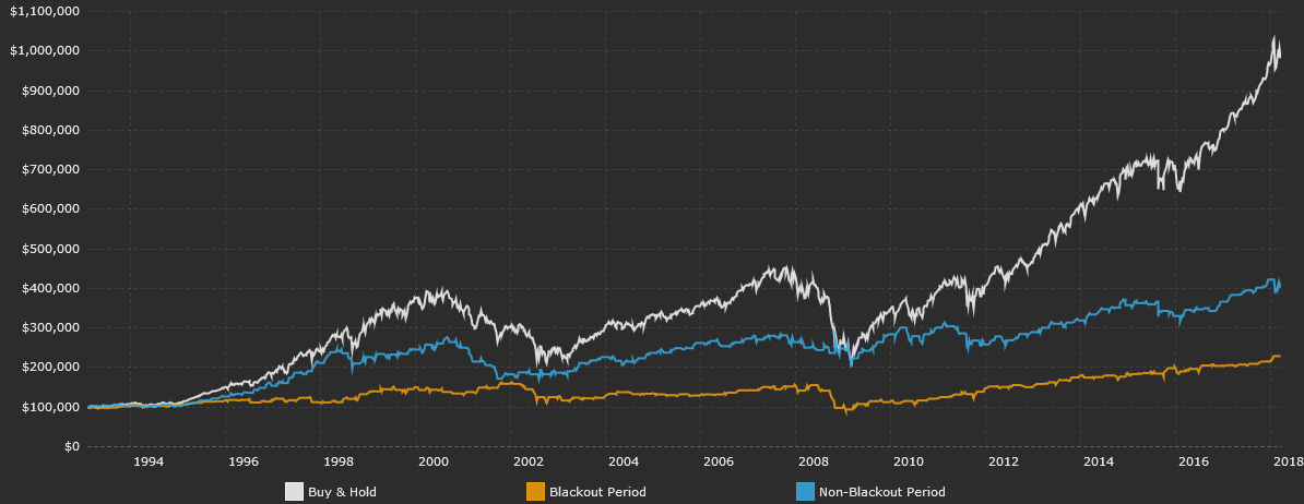
We are currently inside the buyback blackout period. Companies typically suspend share buybacks in the five-week period leading up to their scheduled earnings announcements.
It’s important to note that this buyback blackout window is different for each company. My period covers the five-week period before a majority of companies report earnings. As a percentage of total NYSE volume, corporate buybacks have increased over the past few years. Data is from Yahoo Finance.
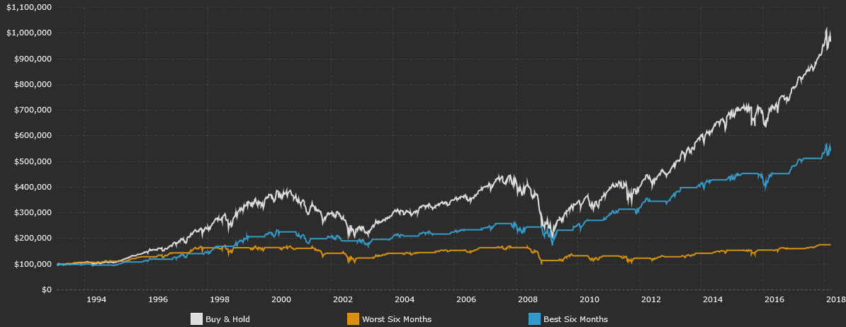
Most people dismiss the saying “Sell in May and go away.” Surprisingly enough, the strategy has worked well over the past few decades (and over the past few centuries in the UK stock market). If Monday falls between November 1 and April 30, my filter rule says to be in the market. We’re currently in this seasonally strong period, although it does come to an end later this month. Data is from Yahoo Finance.
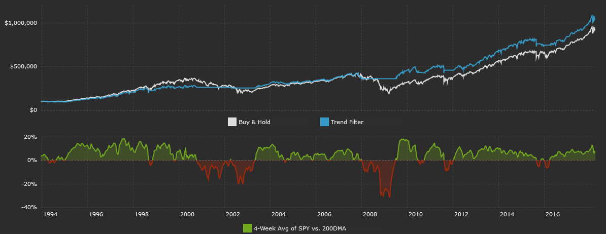
The classic trend-following approach is to have long exposure to the S&P if the index is above its 200-day moving average. That works, but you get whipsawed with a lot of false signals. That’s why I use a four-week average of SPY’s distance relative to its 200-day moving average. It’s a bit slower on catching big moves, but signals fewer false positives. The S&P is currently above its 200-day moving average, meaning it’s in an uptrend. This trend measure has recently deteriorated as the S&P has fallen, but the index is still in a long-term uptrend.
Following this trend strategy would have kept you invested in the market since March 2016. The main benefit of long-only trend-following strategies is not in higher returns, but instead, through (hopefully) lower volatility. Data is from Yahoo Finance.
Margin debt increases as investors pledge securities to obtain loans from their brokerage firm. FINRA releases margin debt data on a monthly basis. It should be noted that I previously used data from the NYSE, but they will soon hand over the reporting duty to FINRA.
It’s important to avoid looking at the nominal amount of margin debt outstanding. Any credit-based indicator will steadily grow over time as the economy expands. Instead, I like to look at the yearly percentage change in margin debt. Most would say to avoid the market if margin debt quickly expands, and there is merit to that. Both previous major market tops were preceded by rapid YoY increases in margin debt.
Overall, though, positive annual growth in margin debt has actually been a positive sign for future short-term S&P returns. My cut-off filter avoids long exposure to the S&P 500 if the YoY change in margin debt is negative. Margin debt has grown by 20.3% over the past year. Data is from FINRA.
Sentiment Data for the S&P 500
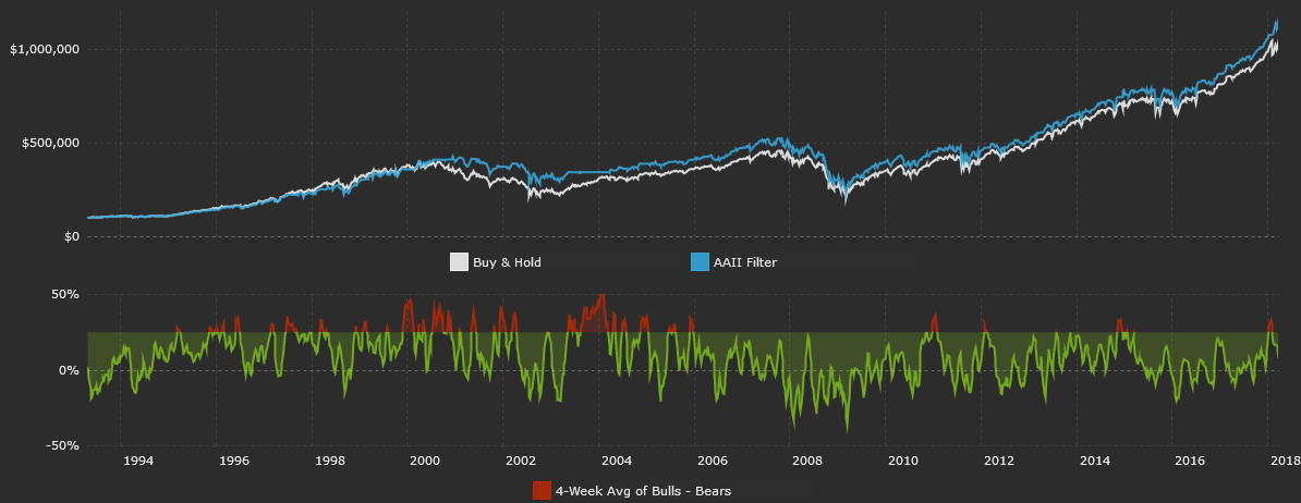
A weekly sentiment survey has been conducted by the American Association of Individual Investors (AAII) for many years. The AAII asks participants if they are bullish, neutral, or bearish on stocks over the next six months. Survey results are typically used as contrarian indicators, meaning extreme bullishness is perceived as bearish, and vice-versa.
There are a bunch of ways to analyze AAII data. I personally examine the spread between the percentage of bullish respondents and the percentage of bearish respondents. This spread has decreased as survey respondents have grown less bullish and more bearish. Data is from the AAII.
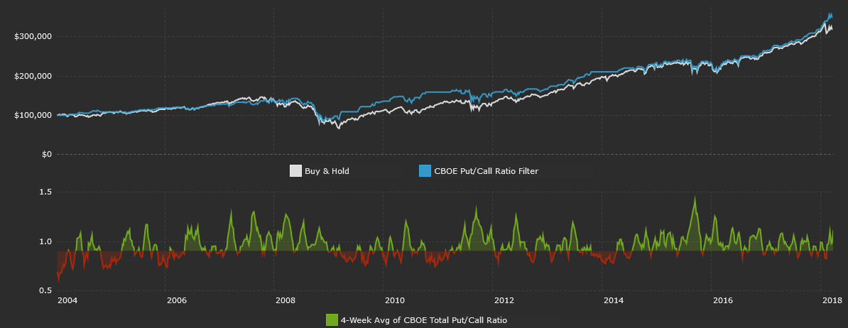
The Chicago Board Options Exchange reports three different put/call ratios: total, index, and equity. The total put/call ratio combines the latter two. I analyze the total put/call ratio since it gives the most comprehensive view of options market sentiment. Historically, it’s worked out well to cut exposure to the S&P when the ratio is low and traders are complacent and not buying equity protection in the form of puts.
CBOE’s total put/call ratio is above the January lows, meaning more investors are buying puts relative to calls. As measured by this indicator, there is some fear in the current market, but I wouldn’t call it extreme. The four-week average of CBOE’s total put/call ratio is still a good bit below the levels seen in September 2015. This indicator is above my cut-off filter of <0.90. Data is from CBOE.
Interest Rate Data for the S&P 500
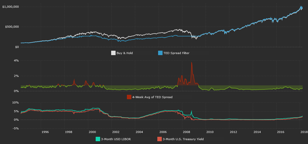
The TED spread is frequently cited as a measure of credit risk in the banking sector. The spread reflects the difference between two short-term interest rates: 3-month USD LIBOR and the 3-month U.S. Treasury (BIL) yield. LIBOR reflects the rate at which banks borrow from each other on an unsecured basis.
The perceived risk in the banking sector grows as the spread between LIBOR and T-bills increases. The TED spread has increased as the rise in LIBOR has outpaced the rise in 3-month US Treasury rates. The current TED spread of 0.44% is still below my cut-off filter of 0.75%. Data is from the St. Louis Federal Reserve Economic Database.
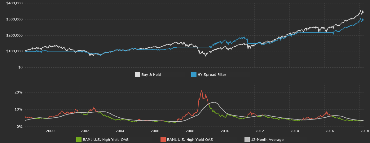
The difference between the interest rate of a high yield (JNK) bond and a Treasury of comparable maturity is called a high yield spread. The narrower the spread, the more optimistic investors are about the probability of higher-risk U.S. corporations being able to service their debts.
When investors grow more uncertain, they will demand a higher interest rate on high yield bonds and cause spreads to widen. My cut-off filter is if high yield spreads trade above their 12-month moving average. For the first time since May 2016, this is the case. High yield spreads are currently 3.70%, above the 12-month average of 3.68%. Data is from the St. Louis Federal Reserve Economic Database.
Macroeconomic Data for the S&P 500
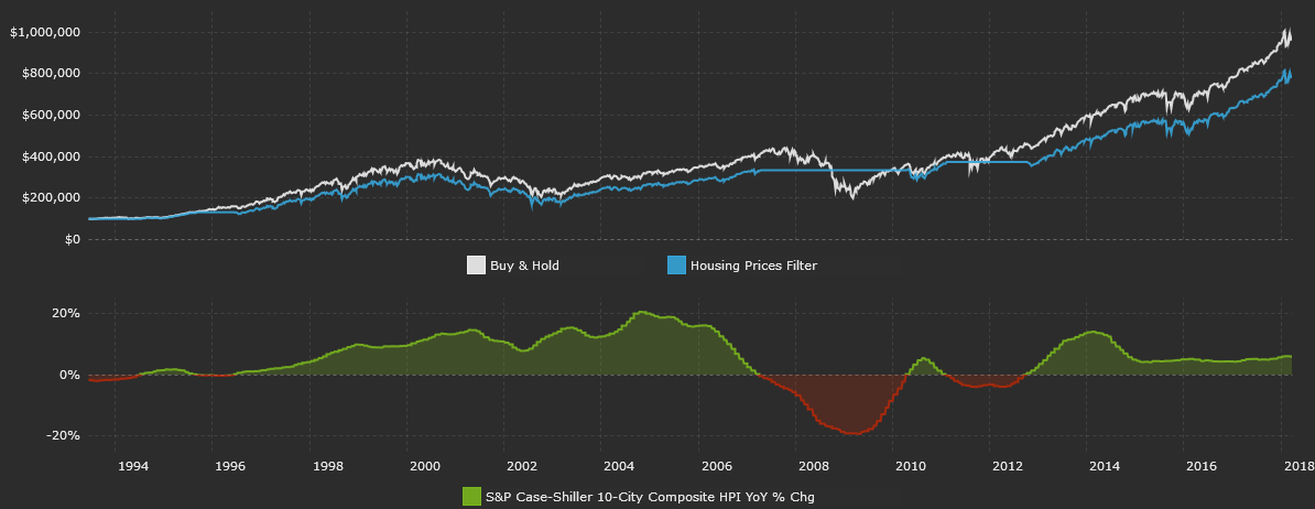
There are a variety of indices that monitor housing (IYR) prices, and I choose to use the 10-city index that Karl Case and Robert Shiller developed. The S&P/Case-Shiller 10-City Composite Home Price Index measures the change in value of residential real estate in 10 metropolitan areas of the U.S.
According to this metric, US housing prices have risen by 5.9% over the past twelve months. Data is from Standard & Poor’s.
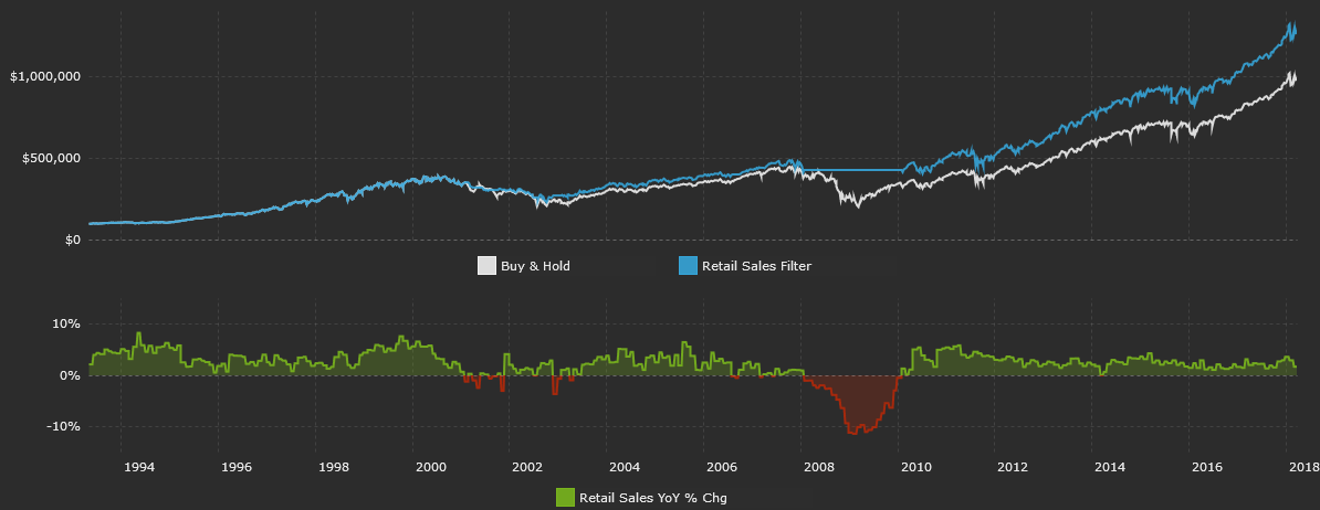
Retail sales reflect the total value of sales at the retail level. It’s a primary measure of consumer spending, which accounts for the majority of economic activity in the U.S. I like to look at real retail sales data that is adjusted for inflation.
Real retail sales are up 1.7% over the past year. Data is from the St. Louis Federal Reserve Economic Database.
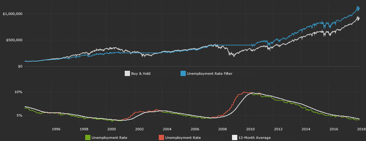
The unemployment rate is the percentage of the total U.S. workforce that is unemployed and actively seeking employment during the previous month. It is a lagging economic indicator, but a persistently rising unemployment rate indicates a weak labor market and thus potentially weak consumer spending.
Since our economy is heavily dependent on consumer spending, a rising unemployment rate is typically negative for future economic growth. The current unemployment rate is 4.1%, below its 12-month average of 4.3%. Data is from the St. Louis Federal Reserve Economic Database.
Composite Model for the S&P 500
Think of each indicator as a building block that helps form an overall opinion. One study might say current sentiment has historically been bullish on stocks. Who cares? That’s just one data point in isolation. I’m interested in a bigger picture view with more context. A picture that also factors in what’s going on with macro data, interest rates, etc. The composite model does just that.
Here’s how it works. Each indicator is given a score of 1 or 0, depending on its current reading relative to its filter rule. If S&P earnings are down over the past year, and the filter rule for that metric is to be out of the market if yearly earnings growth is below 0%, then that indicator gets a 0. The table below summarizes data from all the previous sections and assigns a 1 or 0 to each indicator based on its current reading.
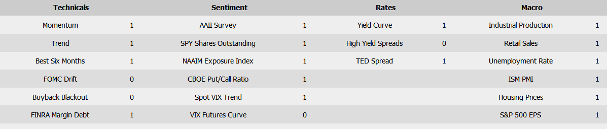
All 21 indicators are averaged to form the composite score. If the composite score is greater than 0.6, the model is invested in SPY. Think of 0.6 as the overall filter rule for the composite model.
There’s nothing special about 0.6 – it results in being invested in SPY about 80% of the time. I could have used a higher filter rule like 0.75 to only be exposed to the S&P when more indicators are saying to be invested, but this results in less time exposed to the market, since it’s a “stricter” cut-off. The chart below plots each individual category average score and the overall composite score.
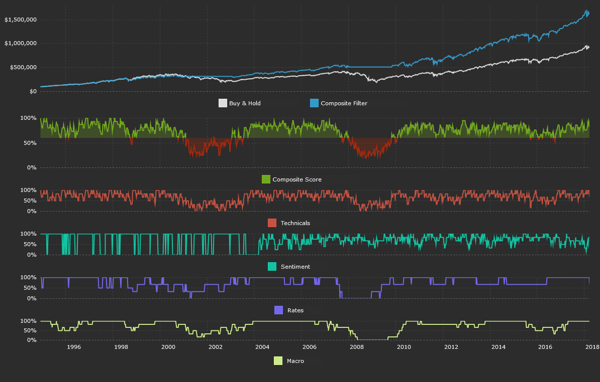
So let’s summarize everything. Technical data is mixed. The long-term trend is still higher, April seasonality is historically positive, and margin debt has increased over the past year. There are some technical negatives. We’re in the buyback blackout period as companies pause repurchase programs ahead of earnings announcements, we’re outside of the historically positive pre-FOMC drift period, and May 1 marks the beginning of the historically worst six months of the year for the S&P.
Sentiment data is now more pessimistic than it has been over the past two years. CBOE’s total put/call ratio is high – indicating more demand for puts, spot VIX is elevated, the VIX futures curve is in backwardation, and the AAII’s investor survey and NAAIM’s Exposure Index reveal more pessimism.
US high yield spreads are now above their 12-month average, the TED spread has risen, and the US 10-2 Treasury yield curve has flattened by 60 basis points over the past year.
US macroeconomic data is still very strong. Real retail sales, housing prices, S&P EPS, and industrial production have all risen over the past year. The US ISM PMI of 60.8 indicates strength in the nation’s manufacturing sector, and the US unemployment rate is low and below its 12-month average. Overall, the composite model is still long. This is because the composite score is 0.81, above the cut-off filter of 0.60.
I update all of the individual indicators and the composite model each week, so be sure to “Follow” me to track future updates!
I hope this article can help you out in your own investing process. Do let me know if you have any questions in the comments below.
Disclosure: I/we have no positions in any stocks mentioned, and no plans to initiate any positions within the next 72 hours.
I wrote this article myself, and it expresses my own opinions. I am not receiving compensation for it (other than from Seeking Alpha). I have no business relationship with any company whose stock is mentioned in this article.
Additional disclosure: The author does not make any representations or warranties as to the accuracy, timeliness, suitability, completeness, or relevance of any information prepared by any unaffiliated third party, whether linked in this article or incorporated herein. This article is provided for guidance and information purposes only. Investments involve risk are not guaranteed. This article is not intended to provide investment, tax, or legal advice. Performance shown for each indicator is of a simulated hypothetical model. Performance is simulated and hypothetical and was not realized in an actual investment account. Performance includes reinvestment of all dividends. All risks, losses and costs associated with investing, including total loss of principal, are your responsibility.
Be the first to comment