The point of the Turning Points Newsletter is to analyze the long-leading, leading, and coincidental economic indicators to determine if the economy is slipping into a recession, or, in the terminology of the newsletter, if we’re at an economic “turning point.
Leading Indicators
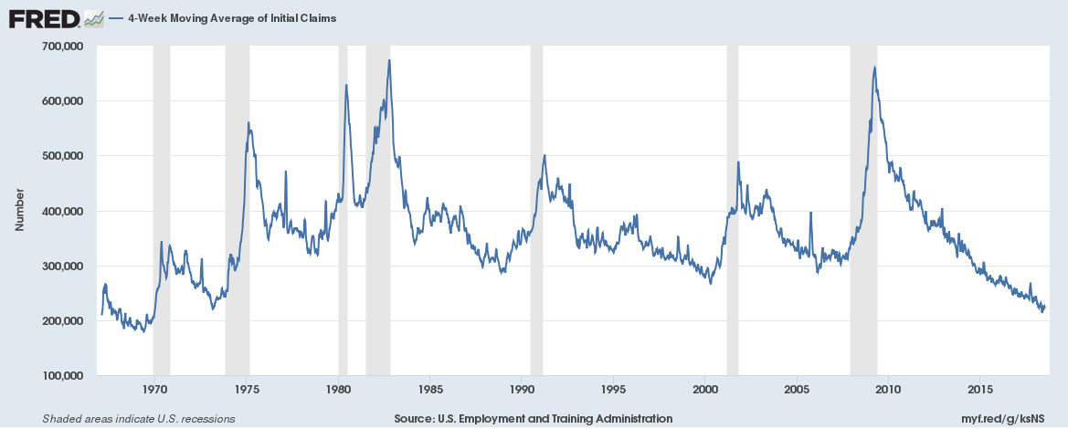
 The top chart shows the 4-week moving average of initial unemployment claims, placing the data into a longer-term perspective. This data has not been this strong since the late 1960s.
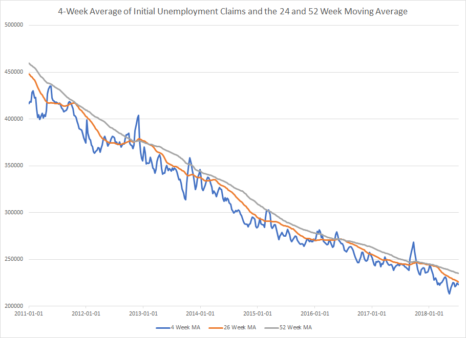
The second chart is compiled from data provided by the St. Louis Federal Reserve’s Fred system. It shows the 4-week moving average of initial unemployment claims (in blue) along with its 26-week (in gold) and 52-week (in gray) moving average. The 4-week moving average has been consistently below its longer-term averages since 2011. All three of these averages removes the “noise” from this data and shows that this part of the jobs market is very strong.
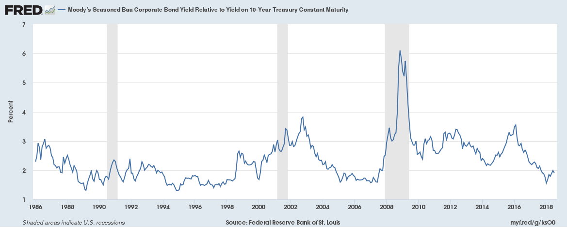 The chart above shows the Baa yield relative to the 10-year Treasury. As Bloomberg pointed out earlier this week, this spread has a pretty good track record of predicting a recession — which is one reason why I monitor it regularly. It recently moved above 2%, which has occurred before the last few recessions. However, lower-rated credits are performing well:
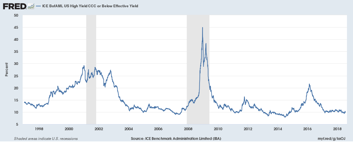 The CCC section of the bond market is still trading at very low historical levels. So, we’re not seeing a wide-spread widening of spreads; so far, it’s contained to the Baa section of the market.
Finally, let’s look at orders for consumer goods:
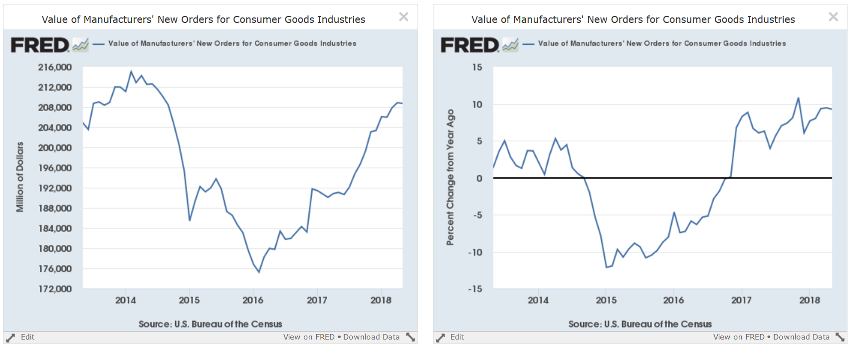
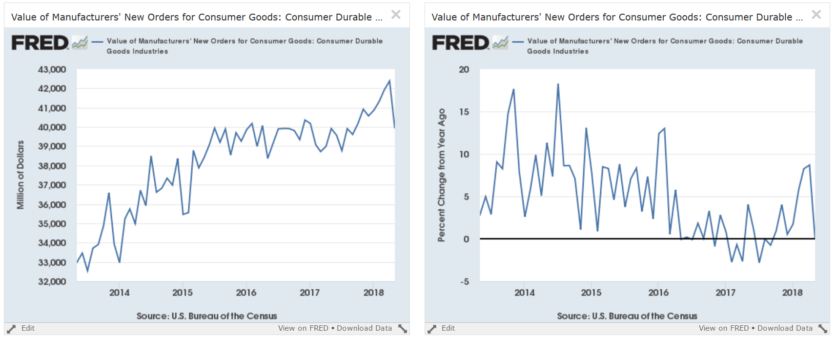 The top charts show the absolute level of consumer goods orders (left) and the Y/Y percentage change in that number. These charts show a very positive market. The bottom chart shows the orders for consumer durable goods, which moved sharply lower in the last report, most likely due to the steel and aluminum tariffs implemented by the Trump administration. This is only one month of data, so we can’t read too much into it. But the magnitude of the decline potentially shows some upcoming weakening in the leading numbers.
Leading Numbers Conclusion: Overall, the picture is strong. But there are some potential issues in the credit and durable goods orders markets that bear watching. The potentially negative data is still far too new to draw any conclusions.
Coincidental Numbers:
There’s not much to talk about this week. I discussed the latest employment report last week, and next week we get fresh retail sales and industrial production numbers.
However, let’s look at GDP data from the national income side of the account, starting with GDI:
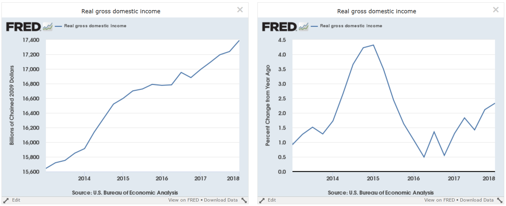 Real gross domestic income is in a solid uptrend (left chart) while the Y/Y percentage change is rising (right chart).
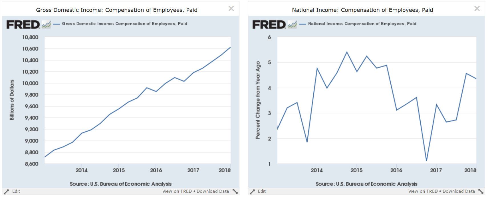 Compensation to employees is also rising solidly (left chart) while the Y/Y percentage change is near 5-year highs.
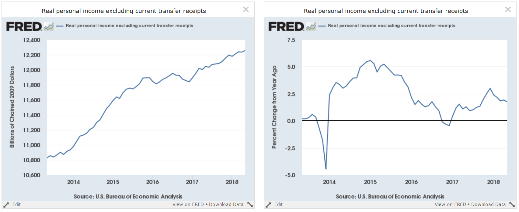 Above is another way to look at income for individuals: real personal income less transfer payments, which is used by the NBER recession dating committee to determine a recession’s data. This number is also growing at a solid absolute rate (left chart) and Y/Y pace (right chart).
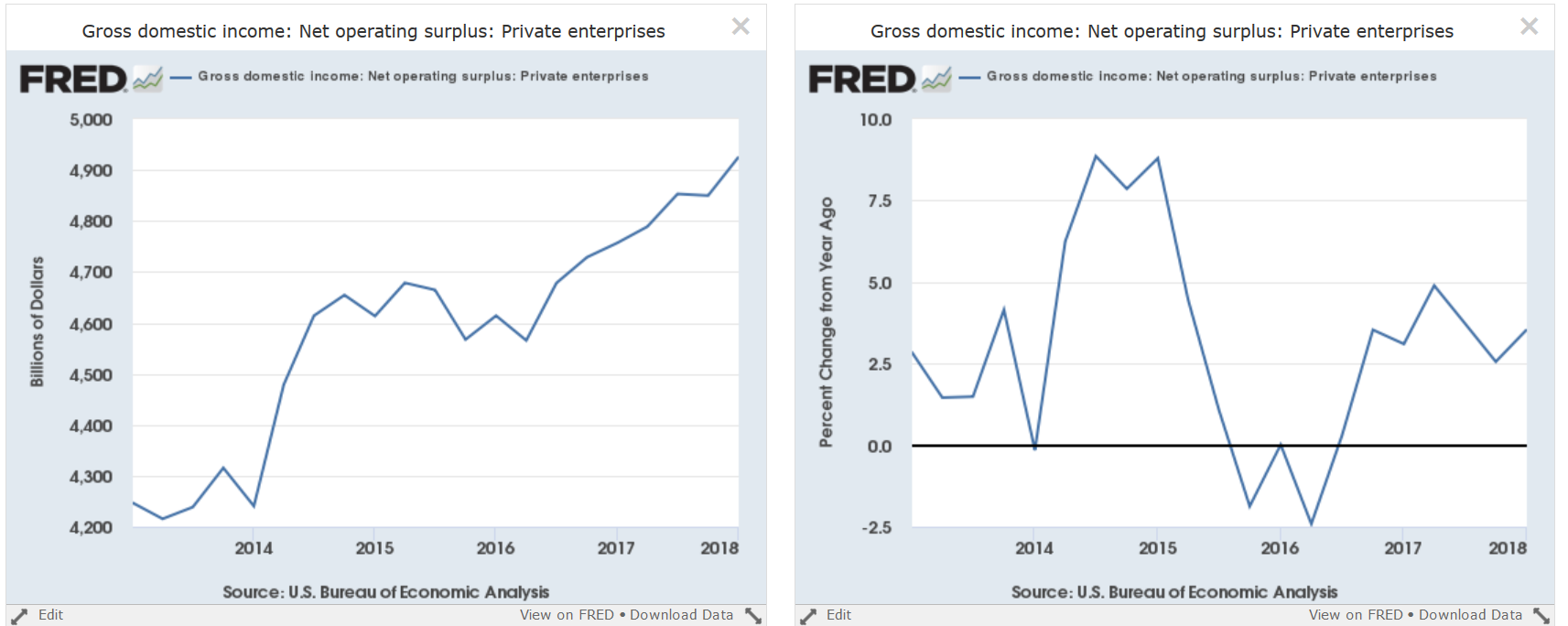 Finally, we have net operating surplus, which is basically the income of self-employed individuals. Like other areas of national income, it’s rising.
Coincidental Numbers Conclusion: these show an economy that remains in an expansion.
Disclosure: I/we have no positions in any stocks mentioned, and no plans to initiate any positions within the next 72 hours.
I wrote this article myself, and it expresses my own opinions. I am not receiving compensation for it (other than from Seeking Alpha). I have no business relationship with any company whose stock is mentioned in this article.
Be the first to comment